
124: “Into the garbage chute, flyboy!”
early-mid 1977 | age 9 or 10 Yay! The old crappy ones again. Now we’re back to possibly very early 1978 for a bit. Isn’t Leia stunningly gorgeous in this one? *gakk*
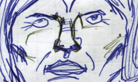
Ugly Leia
Art Notes: She’s… beautiful!
Isn’t perspective on faces an awful bitch when you’re only 9 or 10 years old? And she has angry wrinkle lines scratched across the bridge of her nose, she’s wall-eyed… Even a later alteration with the greeny-black biro couldn’t improve it. It might have made her even worse! Did Luke really say dreamily, “She’s beeeeautiful…”?
At this time I was still under the Warlord Comic influence—see the spent cartridges flying out of the guns? In panel 1 the red fire appears to be scrawled in my trusty thick permanent gore marker! You can just about make out two little Stormtroopers at the end of the corridor amidst the blasting. All in all I love this page.
Film Notes: I prefer an older perspective
One of the stupidest CGI changes to the original film was the one below.
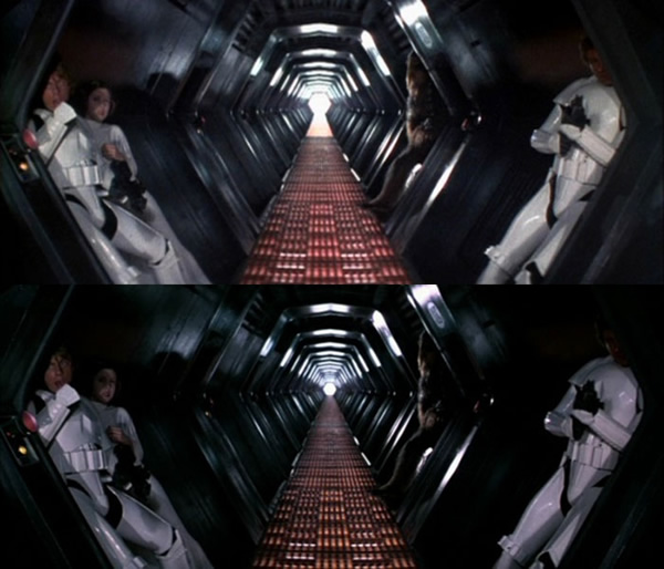
Yeah, that was really worth the effort… Now it looks duller
Apparently the matte-painted corridor (which to me looked brilliant) wasn’t up to scratch when they decided to re-release the film in 2004. So they re-did it. The author of this fascinating SW versions-comparison site writes that the perspective was corrected. I was actually about to go into a big rant about George pointlessly fecking about with the film but then tried superimposing both images above—myself. I actually can’t see any difference in the perspective. What they did do was to lengthen the corridor. Oh, and remove some of the nice colour and make it darker.
Well done lads.
Paolo Uccello
Paolo Uccello, the Italian Renaissance painter who lived and worked in Florence was a perspective nerd. Giorgio Vasari in his book Lives of the Artists wrote that Uccello was obsessed by his interest in perspective and would stay up all night in his study trying to grasp the exact vanishing point. Vasari says that this drove his wife to distraction.
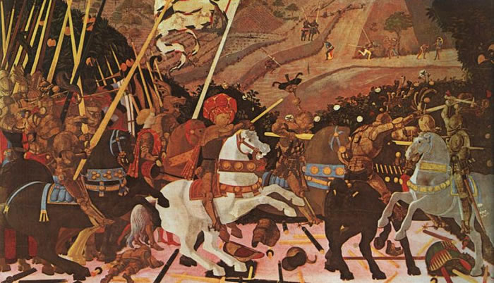
(1 panel of) Battle of San Romano – Paolo Uccello, c.1438-40
Battle of San Romano
Uccello’s famous painting—now in panels separated by continents—uses perspective in the most self-conscious manner. If you look at the fallen lances and bodies on the ground you can see that they’ve been arranged in a very artificial grid form, all pointing very obviously, to a common vanishing point. Do you think Paolo was sort of missing the point of visual storytelling in this image?
P.S: Do you think scores of CGI’d Jedi blurring into battle, lightsabers flailing (as secondary background action) sort of misses the point of visual story-telling too?

Discussion ¬