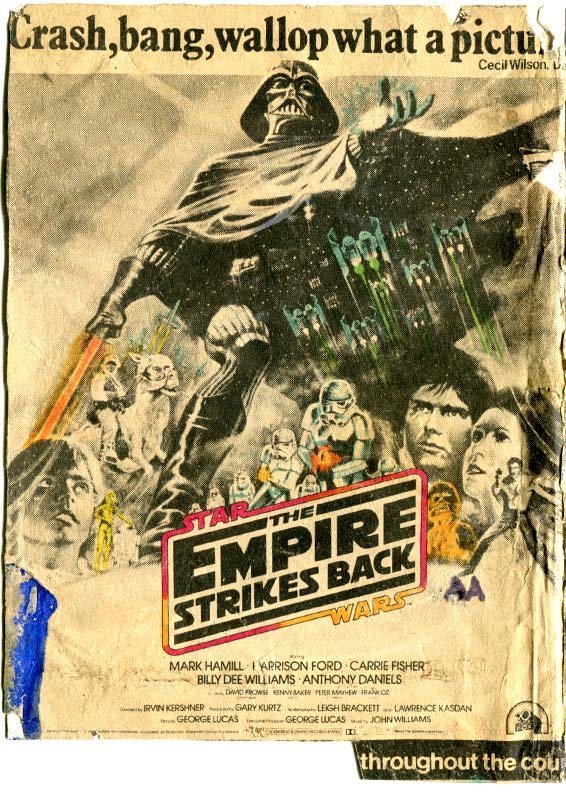
Empire Strikes Back Comic Adaptation: Front Cover
So, here’s the cover! As you can see, I preferred to use the official artwork and design than make my own. Anything that made it seem more like the real thing—more official—was a plus for me!
This image was lovingly clipped from the local Leinster Leader Newspaper cinema page. The ad was a big one! A5 size, and fitted perfectly onto my folded over A4 comic format. We’d probably never seen an ad that size for a film in the cinema listings page.
Actually, whenever we got the Leinster Leader newspaper, that was first page that I’d excitedly flip to. The rest of the thing was of no interest to the young me. As you’ll recall, I did the same thing with the front covers of my ‘Star Wars’ comic adaptation and my ALIEN comic adaptation.
I’m not sure what the ‘double A’ thing is that I added. Maybe I put in in over 12 or PG or something?
So, what are your memories of the cinema ads and posters? Let us know in the comments below!

Great to see the Star Wars continuing John, even if you didn’t complete your Empire adaptation.
I have that same advert, clipped from a magazine or newspaper.
Was the “AA” an emulation of the British “AA” certificate (meaning over-14s only)? In fact, Empire received a U certificate in the UK, despite the tauntaun innards and Luke’s severed hand.
Hiya Darren.
Perhaps the AA got damaged and I crudely restored it?
I’ve no idea how the film classifications worked in Ireland. We had 18, and maybe X? I somehow doubt we had X though, as this was Ireland–in the eighties!