021: Meet the Death Star (again)
Whe-heyyy! We get to gaze upon the Death Star a second time.
And check out the newly added SWa9 SPECIAL EDITION version. Can you imagine navigating that squiggly trench? I think you’d need a few X-Wing-handbrake turns.

It’s a another SWa9 Special Edition version! [see more]
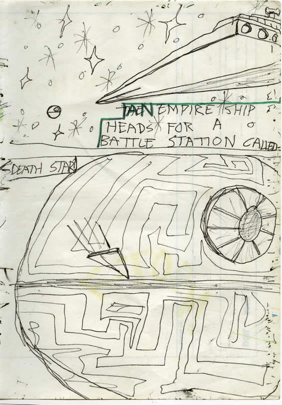
THE AN EMPIRE SHIP HEADS FOR A BATTLE STATION CALLED –
DEATH STAR?
I’ve only just noticed after publishing this page years ago, that there might be a question mark after ‘Death Star’.
Art Notes

“The most awesome power in the universe!”
Oh how I love these old pages. I mean, I was only 9! They really really take me right back. No need for rulers – no need to even draw around a saucer or roll of sellotape to make a circle!
You can see how the opening text was crudely altered to be contiguous with the newer slotted-in pages. You know, much as I love these, the most childish looking pages, I’m actually amazed at just how childish they are!
Site Notes
Adversity and excuses, excuses…
[originally written in 2011 – John] The weather in Baltimore, County Cork is really holding up well so it’s a nice holiday. My only complaint is being unable to do good in-depth and creative updates to this site. But I think if left you hanging for 2 weeks the site might lose what miniscule readership it has!
Next: A preview of the droids’ plight on Tatooine
PANEL 1
-----------
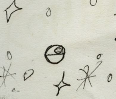
We see black-ballpoint-drawn wobbly stars and a tiny wobbly planet-like object. Then, an Imperial Star Destroyer/Cruiser comes in from the left:
'And Empire ship heads for a battle station called--'
PANEL 2
------------
'--Death Star!'
The Death Star fills the panel, dwarfing the Star Destoyer ship which moves in to dock with the battle station.

I like how you Special Editioned out the ‘the’…
Hi Dan, thanks the comment! Things are very slow around here these days. Site seems to be dying a death since it migrated to the new Facebook page.
Yes, it’s a tricky decision whether to correct stuff like that. But, the original is still there I suppose. Glad you like it. The colour was based on a couple of YouTube screenshots so I hope they’re pretty close. I must look at the original release though. I fear that the Lucas SE versions have slightly different colouring. The Death Star as shown in one of my old books is more browny/beige looking funnily enough! The nice navy-blue halo above the cruiser’s engines in the top panel mightn’t be in the original release either. Unfortunately I can’t play that DVD on my PC.
This was great fun to do and actually a lot trickier than the others.
Yeah, I remember the death star having a brownish tint too. I also like the way you’ve retained the childish simplicity of the stars in the top panel by leaving them as outlines.
Really? I still have to check the original for the colours.
I find it so cute to see the shorthand symbols that my son uses for things (like those stars) and being young they see them as perfectly realistic. It’s funny how your perception changes as you learn more and more. I suppose that’s the reason why lots of older pages got thrown out and replaced – with boring better ones.