164: “Now, man your ships—and may the Force be with you!”
early 1978 | age 9 What a wonky looking page this is! It’s even more childish than the «previous one. I love it though. Ah… childhood.
Mourning what might have been 🙁
It’s nice to see some original 1978 pages that actually follow one another. Alas, these cut-off pages, at the back of the book, that were later stapled together are missing their other halves. I wonder what early parts of the film were on the right-halves that were thrown away? I would dearly love to still have those. Oh, but to have the entire first-pass that I ever drew. Ah well…
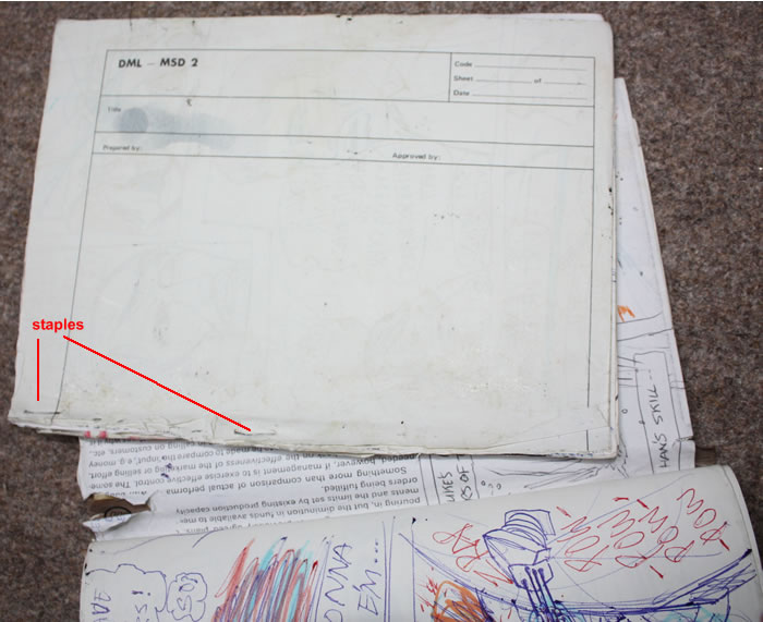
These were added to the back of the book when I ran out of pages. Where the other halves cut off and thrown away, so I lost lots of the the earliest parts of the comic from 1978?
Of course, thinking about it: it is possible that there was nothing drawn on the left halves. I mean, if I was running out of pages towards the end of the book, for finishing the story, I might have just put half-pages there so I wouldn’t have loads of blank halves at the start. But, I fear this wasn’t the case. I just don’t think a load of blanks at the start of the book would have bothered me that much. Why would I want a comic with a bunch of half-pages at the back that would fall out so easily? Far neater to keep using whole pages. And I know for a fact that I dumped lots of pages. My mum saw them in the waste-paper bin and urged me to keep them. I’m not sure if I did though. I wasn’t as sentimental about them—then—as she was.
. . .
Art Notes: Spiffy Computer Graphics
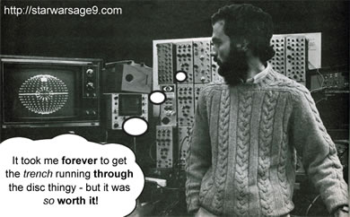
Larry Cuba – went through hell. But why Larry, why?
The animated Death Star Schematics were very impressive back in 1977. Larry Cuba was the clever guy who slaved over them. 20 hour work days, sleeping by his desk (a la John Lassiter at Pixar), computer crashes and tight deadlines were part of the job. Ah, the joy of work.
I just wonder: why? I mean, just look at my 9 year old take on it. It probably took me all of 10 minutes with very little effort. Cheap black biro, light-blue felt-tip pen. Et voila: job done. Seriously Larry—would you look? Yes. That’s right! The results speak for themselves.
Economical or what?
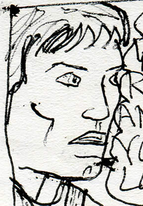 I’m joking of course. Great job, Larry. I’m honestly stunned by just how primitive some of my drawings are! And they’re very inconsistent too. For example: look at the X-Wing and the final panel with Luke. Not bad for a 9 year old. But now look at the rest of the page? It makes me wonder if I just cursorily scrawled the less interesting bits as quickly as possible with filler stuff—with one eye on the TV?—in between the shooting and the space-ships bits.
Awww… cute
Don’t you think it’s touching to see Luke running like that? Excitedly calling “Han, Han!” (I could imagine him having pigtails). The next crudely scrawled—but very cute—panel is wordless. No response from Solo. Feeling guilty? Torn feelings? His shoulders are up. Maybe he just can’t find the words…
Well, you’ll find out on Wednesday!
Han gets his reward
. . .

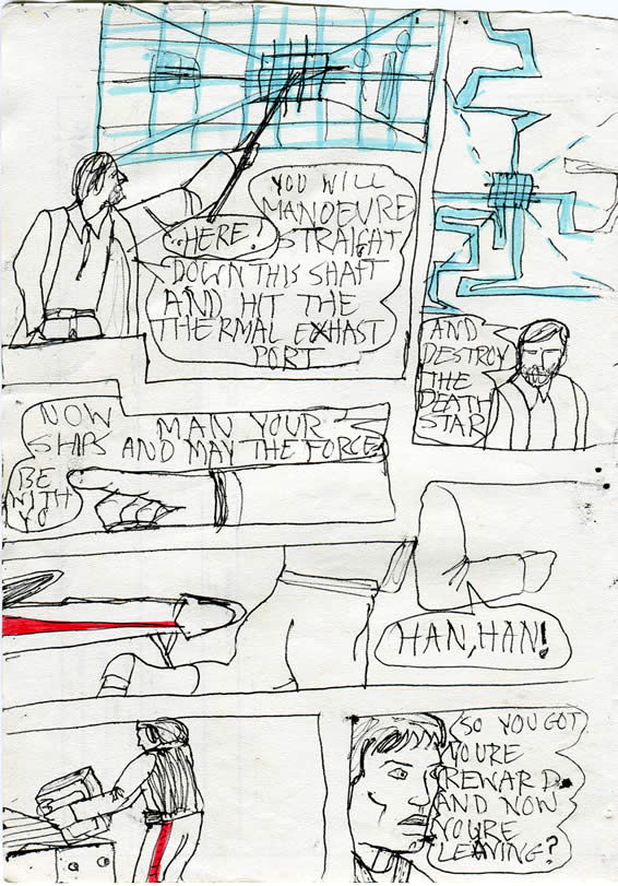
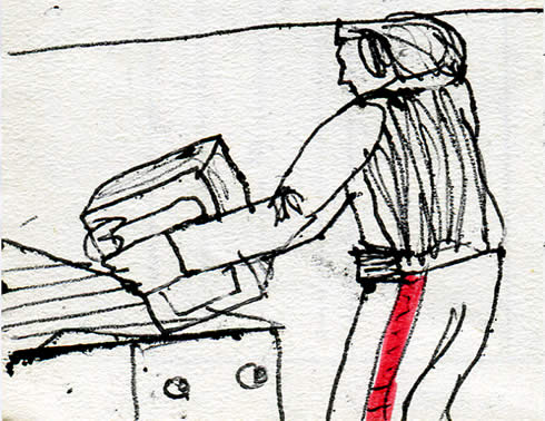
Well, the nose is the easiest part of the X Wing to draw, right? So that makes sense from an economy perspective. Sort of like Wally Wood.
That’s a very good observation, Rob! I wouldn’t be at all surprised if that was the reason I just stuck that bit in.
It also has a fun to colour red stripe 😉
My dad said to his workmates around 1977, that when I was little (even younger than 9), they noticed that I liked to stick the fronts or the backs or cars coming in the sides of my drawings. Think they thought—like you—that I was saving myself a bit of work and not having to draw the whole car!
I prefer to think that I was ‘composing’ my pictures in interesting and dramatic ways, rather than just sticking things in the middle of the page like most non-arty kids would.
Don’t be to hard on yourself john, that’s my job! 😛
Keep up the good work 30 years ago. 8)
I wish I could go back and do some more T!
Don’t we all?