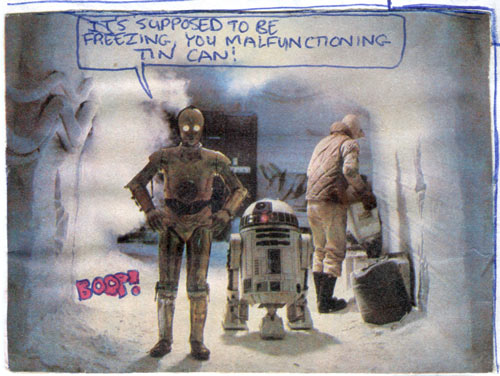
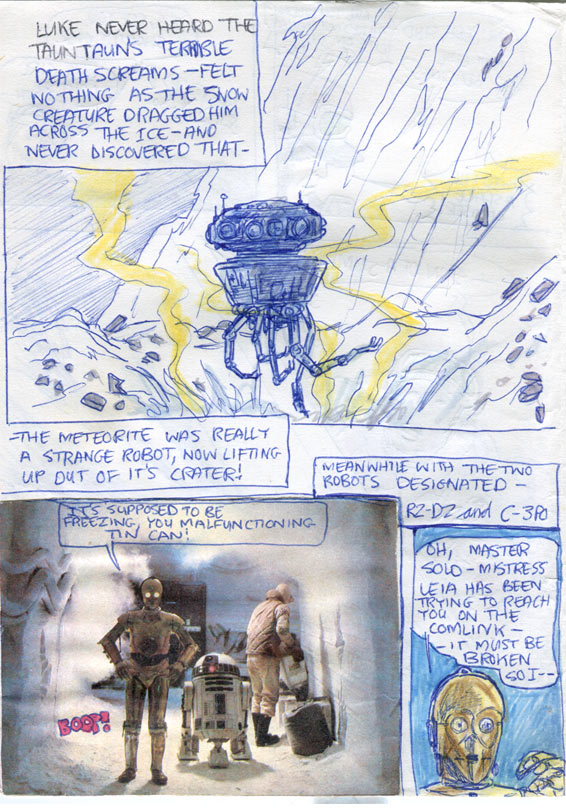
Age 12/13? | 1980/81? We meet the Droids designated Artoo Detoo and See Threepio!
That “designated” line is lifted straight from Roy Thomas’ script in the Marvel adaptation of ‘Star Wars’. I hadn’t copied it into « my own version of that film, but I must have liked it so much—in retrospect—that I used it in this one!

As ever, adding authenticity to my Star Wars product with clippings!
ART NOTES
The first panel here looks like it was influenced by Al Williamson’s art in the Marvel version—but it’s quite different too in some ways. So, it’s hard to say really. It looks cool here with the drifting smoke or steam—all modesty aside—and it doesn’t appear this way in the Storybook or the novelisation.
Al Williamson and Howard Chaykin
Incidentally, the annual book version of the Marvel adaptation has amazing art but the colouring is—in my opinion—frankly horrible, and bizarre. Now, kudos for using unusual colours rather than just sticking to white, greys, and blues for all the snowy and icy scenes, in and out of the base on Hoth, but at times it’s just nuts. It also makes the art hard to figure out at times too. When I borrowed my pal John S’ copy of the annual, which he got for Christmas, Al’s art blew me away—and I inevitably derived much inspiration and learning from it—but I don’t recall the colouring bothering me so much. But then, it was over 3 and a half decades ago! I wonder if the individual comics as printed in the US had the same mad colouring?
I must check my UK comic versions which looked much better printed only in black & white. Amazing actually. Howard Chaykin’s art (which he is unfortunately ashamed of) on the ‘Star Wars’ adaptation was looser and more expressionistic and impressionistic, and I loved it. But at the time I, and I suspect many others, wanted something that looked slavishly and exactly like the film because we couldn’t just watch it whenever we wanted to—like today. When the Empire adaptation came out with Al’s art, it looked so real, and so like the movie it was a joy! Very exciting. I know this is never a measure of good art, but it looked as if he’d used loads of photographic references. As a kid, that was just fine by me! These days, Howard Chaykin’s version is exciting in that it gives a very different take on the film. It’s nice to see that. Another view. The recent The Force Awakens comic adaptation has excellent artwork, but it so slavishly replicates what we see onscreen that I wonder: what’s the point?
I read once that George Lucas got Howard Chaykin to do the first adaptation of 1977 because he was a huge fan of his art, and even had original Chaykin pieces on his office walls. But on Empire it seems George decided to go with a style that was truer to the film’s visuals. It could be that he was impressed with Al’s art on the newspaper comic strip adaptation of the film—which is stunning!
I also must check to see if the annual book version of Empire has been cut up and resized and re-jigged from the comic version. It’s possible. And it would help to explain some of the very small panels which make the art difficult to discern.
I’d love to read your comments below. What were the first images that you saw from The Empire Strikes Back? Which artist did you love the most on Star Wars comics? Tell us all about it.

Luke “never discovered that the meteorite was really a strange robot” — the entire ESB plot happened because of Luke’s misfortune/mistake. “There’s a meteorite that hit the ground near here. Let’s check it out! It won’t take long,” he could have said to Han, because they were out there together for a reason.
Hi Phil.
Do you think he wouldn’t have had his ‘Ben vision’ unless the Wampa had attacked him?
So he wouldn’t have gone to Yoda, and maybe not to Cloud City either—depending on how sensitive he was to Han’s torture induced distress. And even if he did pick up on it and go, how would the Vader fight have turned out without his 2 day Jedi Bootcamp training?
You’re spot on with your comments about Chaykin’s and Williamson’s art, John. In those days, I suspect we all wanted something that represented the film as closely as possible in print. Today, I like Chaykin’s art, wildly stylised as it is. I think the Marvel team only had the script and photo material when they adapted Star Wars, so it would surely have been very difficult to capture the feel of the movie.
Yeah, I love Chaykin’s version too. The first issue was pretty wild and rough—due to:
– A lack of ref material, as you said
– Severe time pressures: he rapidly pencilled AND inked it himself
In later issues he had various inkers helping him. In the ‘Last Battle (of Yavin)’ scenes there’s an inker who’s very precise working over his pencils. Lots of clean straight lines on all the hardware etc. Chaykin’s loose brsuhed style is pretty much obscured.