000: Star Wars Comic Cover
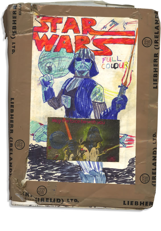
c.1978 or 1979 | age 10 or 11 Presenting! One of the many front covers that were made for this ‘Star Wars’ comic book adaptation.
In the beginning…
…there was the cover! But—it was not this one. So what did it look like? Was it rendered crudely in green marker?» —or green biro?» In thick black pencil-crayon? Who knows? Then let us pray that someday, somehow, perhaps: it’ll turn up. Because it’ll be even funnier and more charming than this one.
But this is how it began—sort of. Waaaay back in late seventies land. When we all had flared pants, long hair and mad wallpaper. (Sighs) Those were the days.
Art & Design
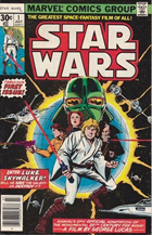
Marvel’s imposter version: Done without my permission
One of the problems I had was that the covers would wear out pretty quickly – just being of thin paper, like the rest of the pages.
And the cover would also be instantly critically assessed every time I picked up the comic to work on it, so it was easily removed to the bin (nooo!) – and another few joyful hours could be spent on designing a new one.
So you don’t know how pleased I was to find another, later, though less funny version! And here it is!

Re-discovered Star Wars comic cover! 1979? [view larger]
Presentation
With the one shown at top, the ol’ presentation leaves quite a bit to be desired. It’s got a scrapbook look to it. For example, do you see the B&W clipping? That was cut from our local newspaper and coloured in with felt-tip pens. As you can see, it’s been crudely reinforced with brown packing tape—classy! That brown tape was brought home from work by dad, and for years you’d hear: “Anyone seen the roll of Liebherr tape?” It was probably in my room. It got used on everything – even a broken pole in my hiking tent! So how on earth did I ever become a graphic designer? Maybe this goes to show that I shouldn’t have. Or, maybe we can call this youthful approach, the future-looking, copy-and-paste multi-media of its day.
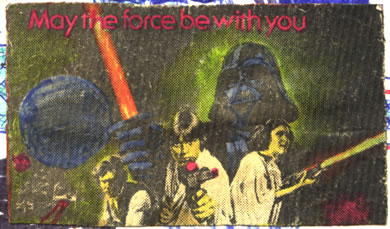
Cut from the Leinster Leader Cinema page c.Dec 1977. Do you know how exciting this tiny, blurry, badly printed, dotty little image was?
But forget all that. Popcorn at the ready, sit back and enjoy Star Wars – as George Lucas might have wished it to have been, but never had the nerve to make it… been. Have been. Didn’t do it like I done it.
Oh wait! – one more thing…
While I’m on the subject, do you think that’s why George kept on tinkering with the film? Adding, polishing, and replacing bits of it with CGI. Do you think if he’d got it perfect first time—like 9 year old me did—he’d have left it alone? I don’t know. But I’ll tell you, making movies is hard. So, I’m going to write this to George to make him feel better. I hope he takes some solace in it, and maybe even enjoys my version of his wonderful film.
Dearest George,
Not everyone gets it bang-on first time. I suppose I was the lucky one! But what’s done is done. No one will ever take from you what was nonetheless, a magnificent achievement. Just look at what your effort gave rise to: This mighty comic adaptation!With fondest and most humble regards, yours,
– John White
Right. Finally: off we go!
Comments below please!
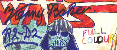
The one that displays here by default shows a wobbly freehand-drawn Star Wars logo in flaming bright red and orange, overlaid with Kenny Baker's autograph.
X-Wing and TIE Fighters fly around, against white space - shooting.
Below the logo is the Death Star, in front of that is a stiffly triumphant looking Darth Vader. Curiously, he has no cape! He holds a lightsaber.
There's a black and white image of the Star Wars poster, clipped out from the Leinster Leader newspaper cinema listings, and it has been coloured in with markers. It's glued-on, over drawings of the Millenium Falcon and an X-Wing.
On Mouse-over, the other cover is shown.
This has a very wobbly green-outlined Star Wars logo at the top, behind which are C-3PO, Darth Vader, and the Death Star. Foreground we see Luke Skywalker with a lit Lightsaber and Blaster. Curiously, there's a Stormtrooper to the left of Luke. It's the same size as Luke, and facing us just like Luke is. Almost as if they're fighting side-by-side. Are these meant to be two versions of Luke? In and out of the Stormtrooper armour? Or is the trooper Han Solo?
We'll never know!
Discussion (6) ¬
Great site design, John!
Love the new comments feature. Plus now I have the chance to go through the comic again and this time comment on the pages as you re-post them.
The cover is awesome, by the way. Both versions actually, although the Vader cover has a lot more impact along with the fact it is inset on an aging old brown cardboard.
Your 9 year old self can be proud.
Cheers Rod!
It was actually just flimsy paper – hence the need for the crappy brown tape around the edges. The incredible innovation of composite, corrugated wood-derived micro-fibres wouldn’t come until my partial adaptation of ESB. Higher budgets mean greater technical marvels. You know, like supermarket box technology.
Well what can I say. I was uploading some pictures in Flickr and I found this picture of yours and checked your site out. Wonderful! I wished I had all my old drawings of Star Wars. As Yoda says truly remarkable to see through the wisdom of childs eyes! I’m sure I misquoted Yoda but I really love seeing art that children create. The old drawings are amazing! Great work and very inspiring. You must join Ijedi.org and post some of your great work over there. I have a fan art group on that site so if you make it over there let me know and I would love to have you there.
I absolutely LOVE this cover. 😀
This is seriously good stuff.
I can see the super-fan work from back in the days before we all had things like “the internet” and “photoshop.” I am a multi-published author and I still remember my first book–we cut and pasted clip arts to each page (with actual paste!) and I xeroxed the covers (solid black–with white text) and I took a red magic marker and colored in the “TOP SECRET” stamp effect. That stupid book ended up getting published and paid my rent for years. But the days when everything was held together with string and chewing gum was the best.
Okay, I have to read this comic now. That cover is the best–seriously .
Hi Dusty,
Thanks for your most enjoyable post! Photocopying wasn’t even something I had access to then – unless my dad copied the occasional thing at the office – and that was a big thrill. Just to see a thing ‘in print’.
Oh yes, I remember doing the ‘stamped’ effect TOP SECRET thing too 🙂
We share a surname. What have you published?